Tutorial
Japanese OG Images with Satori: The 5 MB Font You Never Ship
· 10 min read
On this page
When I added Japanese posts to this site, the OG image pipeline was the one part I expected to just work. It already generated a card for every English post — Satori for layout, resvg for rasterizing, an Astro static endpoint to run both at build time. Adding a locale is a routing problem, and routing was already solved.
It was not a routing problem. Latin and CJK are different jobs for Satori, and the failure mode is quiet enough that a broken build looks like a working one.
What happens when you forget the font
Satori draws a glyph only if it exists in a font you passed in. There is no system font, no fallback chain to the OS, no download. So the first thing worth measuring is the failure: hand Satori only Inter — Latin and nothing else — ask for a Japanese title, and this is what comes out.
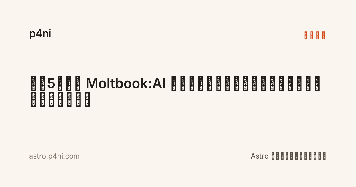
Every kana and kanji became a black box stamped NO GLYPH. The category label and the tagline went the same way. Moltbook:AI and the digit 5 survived, because those are the only characters Inter had.
The part that matters: astro build exited 0 and printed no warning. I hooked console.warn during a render to check, and Satori emits nothing — not for a missing glyph, not for a run of forty of them. The build is green, the PNG is well-formed, the file size looks plausible (25 KB against a normal 37 KB), and the card is garbage. If you generate cards for a locale you can’t read, put eyes on one file before you trust the pipeline.
Which font file to hand it
Two Satori constraints from the earlier post still apply and both bite harder here: no woff2, and no variable fonts. For Latin that’s an annoyance. For Japanese it decides your options, because most CJK webfont distributions are woff2 — the format exists precisely because these files are big.
I ended up checking two static woff files into src/assets/og/, one per weight, covering the Japanese subset of Noto Sans JP. What’s actually inside them, read with fontTools:
noto-sans-jp-400-normal.woff   2,654,856 bytes   13,895 glyphs   13,827 mapped codepoints
  CJK unified ideographs (U+4E00-9FFF)   12,747
  kana (U+3040-30FF)                        189
  fullwidth forms (U+FF00-FFEF)             224
  Latin (U+0020-024F)                       191

inter-latin-400-normal.woff       30,696 bytes      515 glyphs      230 mapped codepoints
The Japanese face is 86× the Latin one. Decompressed to sfnt it’s 4.56 MB, which is the size Satori actually parses. Note what is not in there: no Hangul, no CJK Extension A. This is the Japanese subset, not “all of CJK” — if you also publish Korean or Traditional Chinese, that’s another font, not another weight.
You need two weights, not one
My card sets its title in semibold, and the obvious way to save 2.7 MB is to ship one Japanese weight and let Satori synthesize the bold. It doesn’t synthesize anything, and it doesn’t fall back to the weight you asked for either:
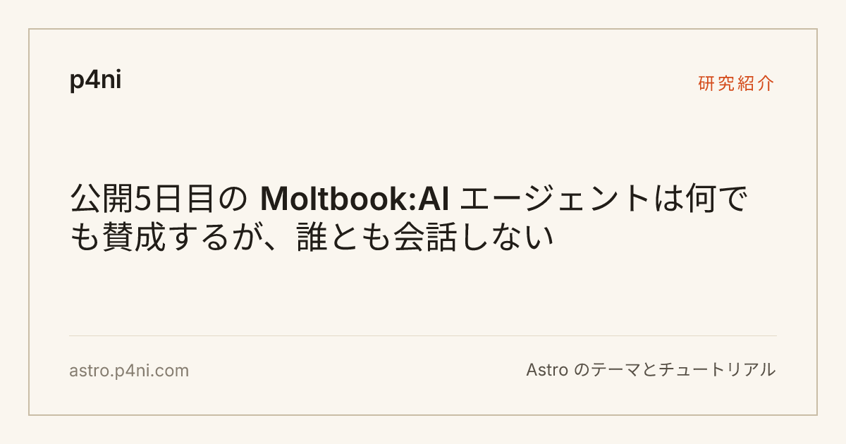
The Japanese sits at 400 while Moltbook:AI in the same line sits at Inter 600. Weight resolution happens per font family, so the Latin request found its 600 and the Japanese request quietly settled for the only weight available. One line, two weights, and it reads as a rendering bug rather than a design choice.
So it’s 5.3 MB of font data for two weights. Which sounds bad until you ask where that data goes.
The 5.3 MB never leaves your machine
The endpoint reads those files with node:fs at module scope, during astro build. The output is PNG bytes written to dist/. Nothing else about the font survives the build:
$ find dist -name '*.woff' | wc -l
0
Three woff2 files are in dist/ — those are the body text faces the browser loads, unrelated to this. The Japanese OG font is a build-time dependency, like a compiler. My whole dist/ is 8.7 MB, of which 1.6 MB is 45 generated cards.
This is the branch point for the whole article. If you generate OG images at request time — a /og/[slug].png route on a Worker or a Vercel function, which is the shape most Satori tutorials assume — then font bytes are bundle bytes, and 5.3 MB is a real problem against a Worker size limit. If you generate at build time on a static site, font size costs you nothing but disk in git. Both approaches are defensible; they just have opposite constraints, and advice written for one is actively wrong for the other. This site is static on Cloudflare Workers, so I’m in the cheap case.
How small could it get, and why I didn’t
Being in the cheap case doesn’t mean the number is uninteresting. I collected every character that appears on a Japanese card — 24 post titles, plus the site name, the four category labels, the tagline, the domain — and subset the font down to exactly that set with pyftsubset:
unique characters on all ja cards: 251  (190 CJK, 61 Latin)

noto-sans-jp-400   2,654,856 → 52,240 bytes   (350 glyphs)
noto-sans-jp-600   2,675,224 → 52,352 bytes   (350 glyphs)
98% of the font is glyphs I have never drawn and probably never will. 12,747 kanji are in there; 190 get used. A per-character subset is a 5.2 MB saving for a two-minute script.
I’m not doing it, and the reason is a maintenance one rather than a technical one. That character set is a function of my post titles, so it changes every time I write a post. Making it correct means generating the subset inside the build — read the collection, collect the codepoints, subset in memory, hand the result to Satori — which adds a fontTools-equivalent dependency and a step that can fail, to save bytes that never leave the machine. If I moved card generation to the edge tomorrow, this is the first thing I’d build. Until then it’s optimizing a number nobody pays.
If you are on the edge and want this: subset per request against the single title you’re about to draw, not against the whole corpus. That’s a few dozen glyphs, well under 20 KB.
Layout: a full-width character is two columns
The card scales the title down as titles get longer. The English version counted title.length, which breaks immediately on Japanese, because kana and kanji are drawn square — roughly two Latin columns each — so 40 Japanese characters occupy the space of 80 Latin ones. Counting characters, a Japanese title looks short and gets the largest size — exactly backwards.
Counting columns instead is one line, and the threshold 0x2E7F sits just below the CJK radical block, so everything Japanese lands on the wide side:
const cols = [...title].reduce((n, ch) => n + (ch.codePointAt(0)! > 0x2e7f ? 2 : 1), 0);
const titleSize = cols > 70 ? 46 : cols > 45 ? 52 : 60;
Across the 24 Japanese titles this site currently has, cols runs from 40 to 103, and every card lands on two or three lines inside the four-line clamp. I checked what character-counting would have done to those same titles: 17 of 24 land in the wrong size bucket, three of them two steps too large. The worst case is 40 characters — comfortably “short” — that occupy 73 columns:
週2日の在宅勤務は成果を落とさない:1,612人のランダム化比較試験が測ったもの
  7 narrow + 33 full-width  =  73 columns
  by character count: 40 → 60px  → 3 lines
  by column count:    73 → 46px  → 2 lines
Nothing breaks: lineClamp: 4 catches it either way, and even at 60px it takes three lines rather than five. But the ladder exists to keep titles at two lines and short titles punchy, and character-counting inverts it — the most Japanese-heavy titles get the largest type and swell to three lines, while a Latin title of the same visual width gets the smallest.
Two smaller adjustments in the same direction:
Negative tracking is a Latin fit. The English card sets letterSpacing: -1.5 to tighten Inter. Applied to Japanese it fits one more character per line, and full-width glyphs already carry their own side bearings — the result is cramped rather than tight. The live card sets letterSpacing: locale === 'ja' ? 0 : -1.5.
Satori has no kinsoku shori. It breaks CJK between any two characters, with none of the Japanese line-breaking rules a browser applies. Padding a test string one character at a time, an opening bracket landed at the start of line two at 21 characters. Across my 24 real titles it hasn’t produced anything ugly yet — Japanese wraps almost anywhere legitimately, which is why this is survivable — but if your titles carry brackets or quotes, look at the cards rather than assuming. lineClamp counts lines and is unaffected either way.
Cost: the font is free, the pixels are not
I assumed a 4.56 MB font would show up in build time. Measured, per card, in milliseconds:
                          satori (layout)            resvg (rasterize)
full 2.65 MB × 2      149.6  5.4  9.5  3.3  3.0     1965  1763  1753  1746
subset 52 KB × 2       11.6  3.8  4.9  8.1  4.2     1819  1768  1741  1785
Parsing the full font costs 150 ms — once, on the first card, after which Satori has it cached and lays out a card in about 3 ms. The 98% smaller font saves 140 ms across the entire build. Meanwhile resvg spends 1.75 seconds per card and does not care what the font was.
It doesn’t care what the text is either. An empty card — same 1200×630 frame, no title at all — still takes 1.68–1.78 s. The cost is the raster and the PNG encode, not the glyphs, which is why the real build shows no gap between locales:
├─ /og/moltbook-ai-agent-social-network.png (+1.81s)
├─ /og/ja/moltbook-ai-agent-social-network.png (+1.80s)
45 cards, 1.73–2.02 s each, ~81 s of a 1 m 26 s build. That confirms the thing I got wrong in the original post — I said the per-card cost doesn’t amortize, and now I know which half doesn’t. Satori amortizes beautifully; resvg is a flat fee per image. The lever is resolution, or caching PNGs between builds. It is not the font.
The output sizes stay close too: English cards have a median of 35.4 KB, Japanese 37.4 KB. Dense kanji outlines cost about 2 KB per card.
Verifying it yourself
The check that saves the most time is embedFont: false. Normally Satori inlines glyph outlines as <path> data, which tells you nothing about which face was chosen. With embedFont: false you get <text> elements with the metrics attached, and the advance widths give the font away — a full-width glyph reports width equal to font-size, which can only have come from the Japanese face:
const svg = await satori(card, { width: 1200, height: 630, fonts, embedFont: false });
// <text width="46" height="55.2" font-weight="600" font-size="46" ...>
That’s also how I extracted line breaks per title without eyeballing 24 PNGs: group the <text> runs by their y, sort each group by x, read off the first character of each line.
Then look at actual pixels. pnpm dev serves the endpoint live, so /og/ja/<slug>.png re-renders on refresh. One card per locale is enough to catch the two failures that don’t announce themselves — NO GLYPH boxes and a weight mismatch.
The short version
- Missing CJK glyphs produce
NO GLYPHboxes, exit code 0, and no warning. Look at one card per locale. woff2and variable fonts don’t exist for Satori. You need staticwoff/ttf, which for CJK means megabytes.- One weight per family is not enough — Japanese at 400 next to Latin at 600 in the same line is the giveaway.
- Build-time generation makes font size a non-issue; request-time generation makes it the main issue. Decide which you’re doing before taking sizing advice from anyone.
- Subsetting to the characters you actually use is a 98% cut (2.65 MB → 52 KB). Worth automating only if the bytes ship.
- Count columns, not characters, when scaling type. Drop negative tracking for CJK.
- Per-card time is resvg rasterizing 1200×630, ~1.75 s, regardless of font or script.
Locale routing was the part I budgeted time for, and it turned out to be the part with no surprises in it. Everything that needed measuring was on the font side.